0

In a Garden,
new bloom 🌱


A breath of fresh air 🍃

You may have noticed, we are slowly changing our identity towards a greener image, more in line with who we are, our values and our proximity to nature and craftsmanship . While continuing to offer products for your whole family: babies, children, women & men.

Thank you for trusting nature, thank you for trusting us

Our new colors


We have chosen new greener colors as a nod to the omnipresent nature in our environment, and also more beige to recall the tenderness, warmth, simplicity and softness in the comfort that we wish to offer.

Our illustrations

You will now see more light, naive, colorful illustrations, with fine lines and small imperfections but made by hand with a lot of love. We emphasize craftsmanship and a love of know-how with complete honesty .
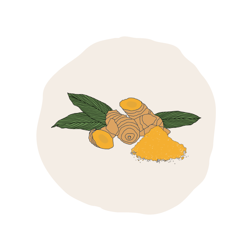
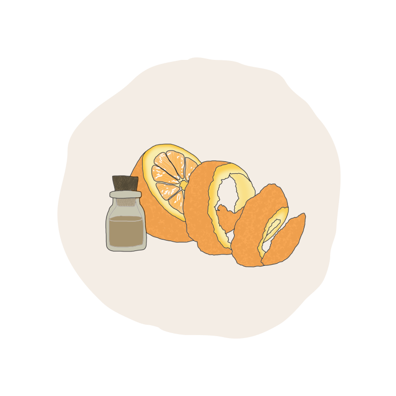
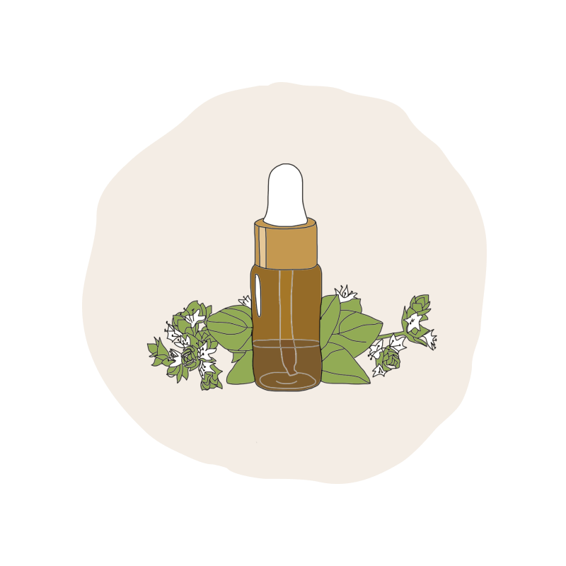
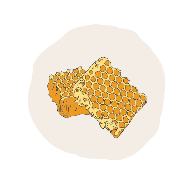
You can find just below the page dedicated to our ingredients which will give you a very nice overview of our illustrations.

Our visual content

Our new brand image also involves a deliberate choice of raw , authentic photos, without any more skin retouching and showing body and ethnic diversity. A touch of graining adds identity to our visuals that we process from this new artistic direction. We want to be as transparent as possible because we create naturalness with naturalness, for all of us. Our goal is to create the most authentic and sincere photographs and videos possible to be as close as possible to you.


Our typographies


Marcellus

Marcellus typography is simple, clear and elegant . It allows us clear and visible communication.

Quicksand

The Quicksand typography is very round, which creates a pleasant , approachable, friendly and optimistic feeling. Some of its wavy lines give an illusion of natural movement.

Our site

Let's cultivate our relationship

Follow us on Instagram